Share a link to an ArcGIS Online map that showcases some data analysis. In a blog post on your portfolio site, reflect on what you worked on and what you were trying to accomplish. How does this map illustrate something about your data? Revisit the questions and struggles from your first pass at using ArcGIS Online: where do things stand now?
I used ArcGIS a lot this semester for my Vivero project. This project required me to figure out the best practices for curating datasets for ArcGIS, representing data in a way that communicates different stories about the history of academic feminism, and making the map user-friendly. However, I didn’t get a good chance to glean new information on the history of academic feminism or do a lot of additional analysis. With this exercise, I got to play with the analysis tool a lot more. Because I switched from Map Viewer Classic to the new Map Viewer, I used the new Map Viewer to conduct my analysis.
For this analysis, I tried to see the ratio of male head of household ages to female head of household ages. I used the Arcade feature in ArcGIS and followed to example to exaggerate my data presentation. Based on the example, this is the code that I wrote: Round(($feature.Male_HoH_Age / $feature.Female_HoH_Age) * 100, 2). I also tried to write this: if ($feature.Male_HoH_Age == 0) {return Area($feature.Female_HoH_Age);} else if ($feature.Female_HoH_Age == 0) {return Area($feature.Male_HoH_Age);}. Honestly, I was confused with that happened and hope to explore this feature more in the future. For the first line of code, I think that made the bubbles bigger and the ratio increased. I’m not sure if that helped. For the second line of code, the map was blank. I don’t think my logic is matching up to ArcGIS’s logic.
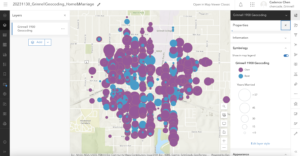
Ultimately, I made my map comparing whether a home is owned and rented and how long a couple has been married. I don’t have the statistical knowledge to describe this data properly, but it seems that the purple dots (own) overpower the blue dots (rent), meaning people who are married are more likely to own homes than rent. There also seem to be more people who owned homes in Grinnell in 1990. Those who rent seem to be fairly spread out on this map as well. Maybe a closer inspection will reveal otherwise.
I feel much more comfortable navigating ArcGIS this time around, in terms of knowing where everything is. Analyzing the data has definitely proved more difficult, but I would imagine with more datasets and more mapping I will get better at this.